Clima4U
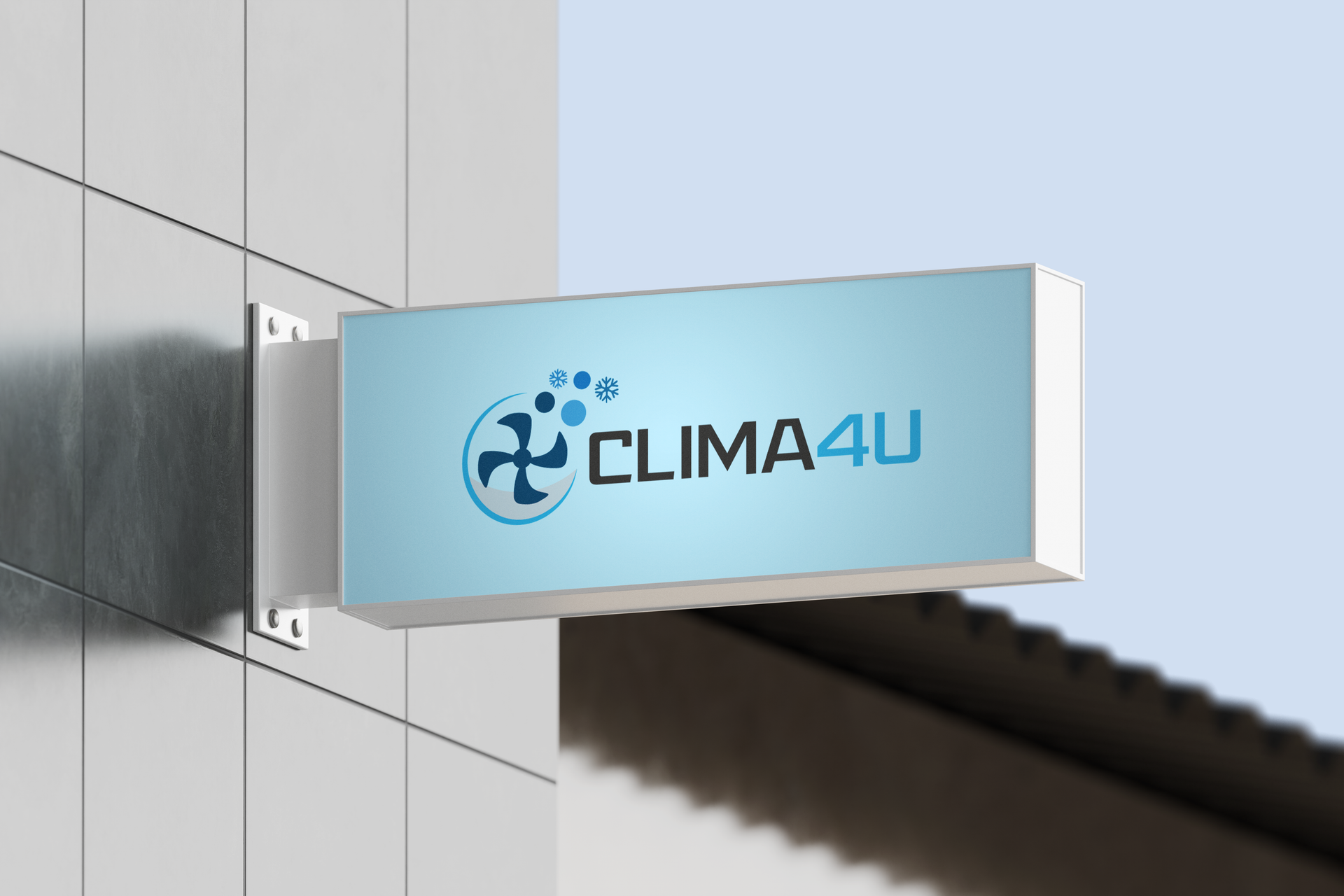
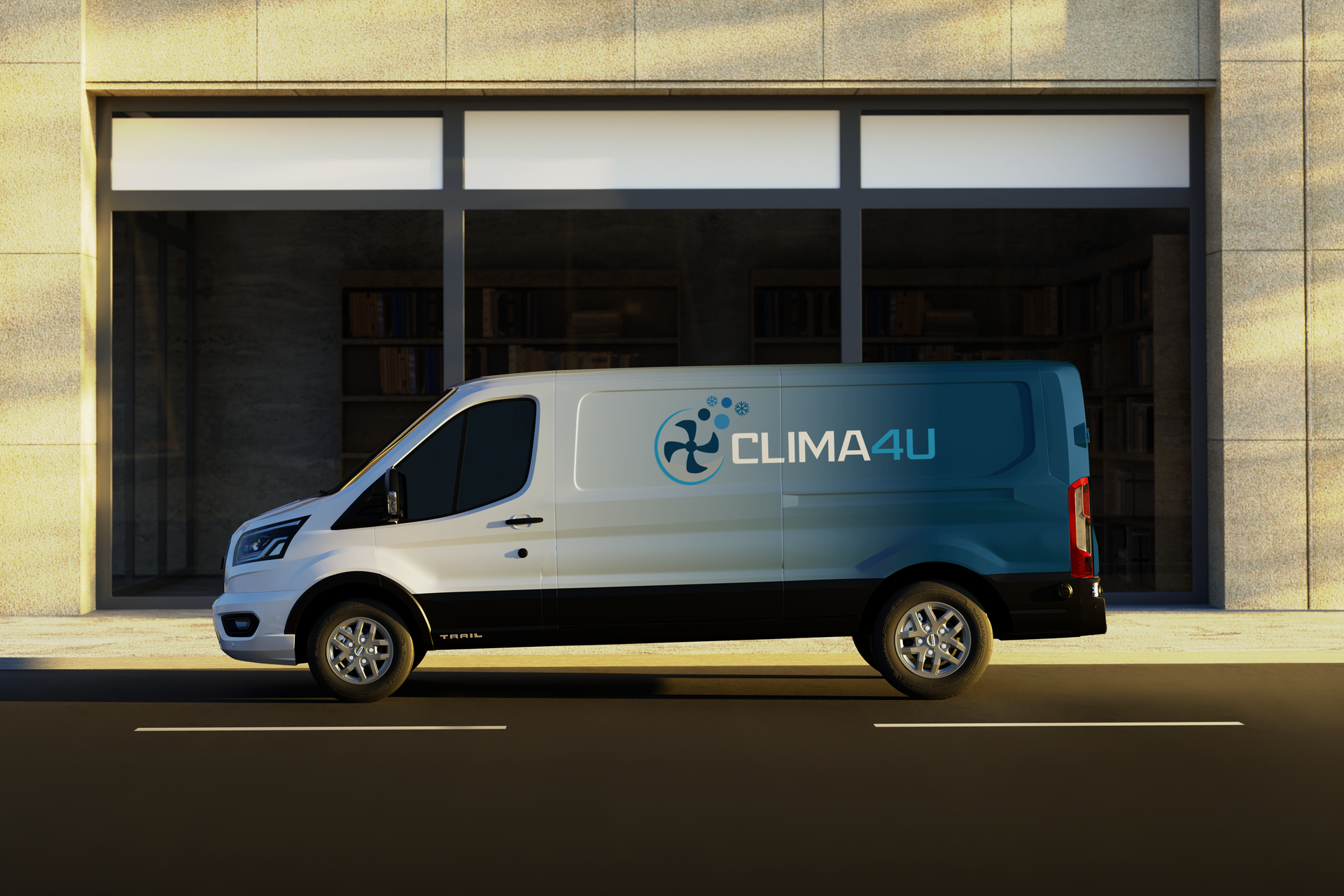
For Clima4U, the goal was to create a visual identity that felt both industrial and refreshing. By combining mechanical elements (the fan) with environmental symbols (snowflakes and air particles), the logo tells a complete story of technical service resulting in a cool, comfortable atmosphere.
Industry
HVAC / Home Services
Services
Deliverables
Year
2022
Challenge
The Challenge : Mixing a literal mechanical fan with abstract bubbles and geometric snowflakes can easily become cluttered or look like "too many ideas" at once.
Solution
The Solution: I used visual grouping. By keeping the fan as the heavy, dark anchor of the mark and making the snowflakes/bubbles lighter and smaller, the eye sees one cohesive "burst" of air rather than three separate icons.
The central propeller is framed by a dynamic "airflow" swoosh and a series of ascending circles. This represents the movement of air and the filtration process, moving the brand away from static, traditional HVAC icons.